A Taster of Atwood

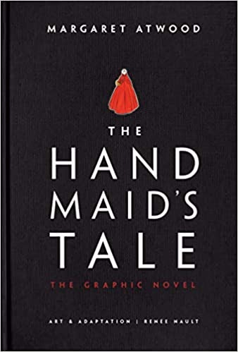
The Handmaid’s Tale graphic novel, a different take on the original book published in 1985 by Margaret Atwood.
The Handmaid’s Tale was published in 1985. However, in the 21st century, it has become more relevant than ever. It tells the story of Gilead, a society with a totalitarian government in which women have been divided into classes one of which objectifies women as reproductive objects. Similarly and in the real world’s Women’s March, women have protested in red dresses and white veils as a tribute to the book and proved that Gilead is not far from reality in some situations. The graphic novel has given it even more popularity, and people worldwide are concluding that it is an atemporal book.
If you decide to read the graphic novel version of The Handmaid’s Tale, you should know that it is solid on its own. The illustrations are gorgeous. The prose’s reduction is definitely based on the reader’s preference for pictures or long descriptions. However, the graphic novel lacks the ability to illustrate the tone of the story to the reader.
The book is illustrated beautifully. The drawings are somewhat simple, but they have the necessary details for a clear comprehension of the text. The color use is very symbolic as when the main character has flashbacks to her old, happy life, the colors are brighter, but, in the story of her current life, they are more opaque. Also, the layout of the scenes is done very flexibly, meaning that the panels vary in shape. In the book Persepolis, the drawings are less beautiful and therefore less enriching to the story. The drawings are all in black and white, and they don’t vary much from page to page. As opposed to The Handmaid’s Tale, the design is very rigid, and the book gets monotonous. The Handmaid’s Tale’s illustrations work better to communicate the author’s symbolism in the book through more fluid designs, which makes the graphic novel more entertaining and engaging.
Even though the novel’s drawings are stunning, they don’t quite fit the story’s theme in some instances. For example, the handmaids’ dresses are drawn very gown-like, bright red, and ball-type. The handmaids, the wives, and the ecowives’ dresses were all remarkably beautiful, but is that really the appropriate look for a society where the dresses have the goal to objectify? The illustrator could have instead created art that evoked powerful, terrifying emotions and, at the same time, made it beautiful. The skill of the drawings is undeniable, but the match to dystopian nightmare feels a little off. Even though the novel isn’t a drawing, Atwood achieves the dark and bleak tone that the story requires better than the drawings in the graphic version of the story. Thus, the novel has more success in conveying the tone that Atwood wants to express.
The graphic novel includes significantly less text than the book. However, the texts that do accompany the drawings were chosen very well, as the short sentences are compelling. Despite the many awards and much praise, some say that Attwood’s dense descriptions and long prose take away from the book’s action and make it less dynamic. In other words, the powerful sentences used by the author are often overshadowed by the long descriptions. The graphic novel, however, maintains the interesting tale’s dynamic and speed without losing details of the places and characters.
The reader should consider reading this book if they prefer a more condensed version of Atwood’s prose while still getting a taste of it. Regarding other comics, it is way superior in terms of drawings, diagrammatic, and prose. However, when comparing it to the original book, there are two key aspects to be considered, one of which can vary based on the reader’s opinion, and another which for me is a mistake. The lack of wording replaced by drawings is based on taste, but still, the only way the reader can comprehend the severity of this totalitarian society is through the writer’s tone, which was the most lacking in the graphic novel.


